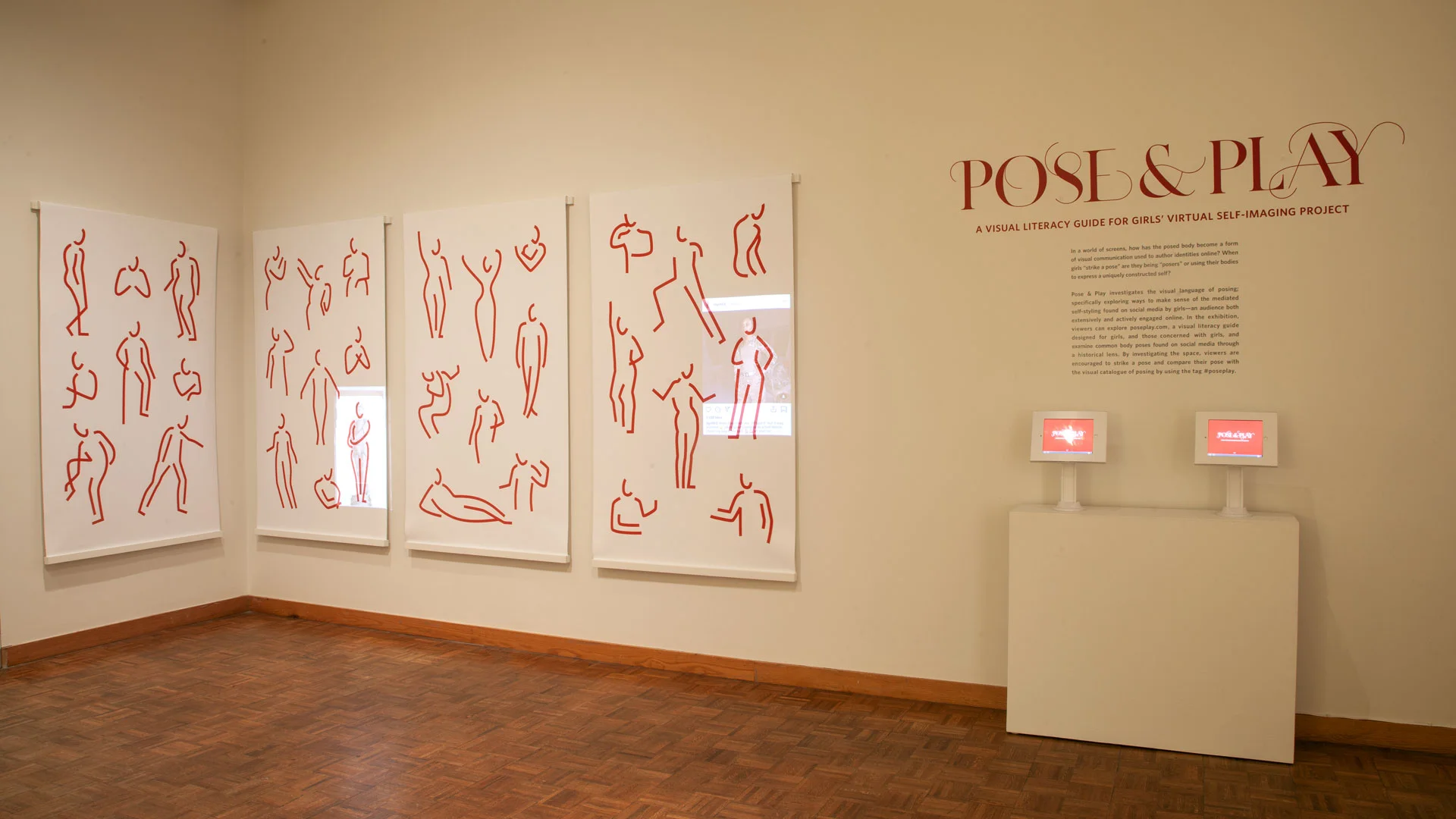
Pose & Play: A Visual Literacy Guide for Girls’ Virtual Self-Imaging Project is a web and exhibition experience which promotes design as a tool for visual and media literacy. The primary aim is to expand the visual vocabulary of posing by investigating the history of some of the most common poses found online. A secondary concern is to encourage conscious decision-making when posing and posting images online. The project consists of three key elements a website, exhibition, and hashtag campaign.
The McDonald Center for Student Well-Being (McWell) is revamping its identity and positioning for the 2018–2019 academic calendar. In collaboration with McWell, I developed a campaign, key messaging, and plan for a strategic roll-out for launching a new social norms awareness campaign, entitled ‘Define Your Normal’.
In a workshop for first year students, the campaign was launched and peer tested. We created a video from interviews with students talking about what it means to define your normal in school. The first year students were then asked to reflect; over 850 students participated. At the end, students were asked to vote on a T-shirt design they would prefer for the campaign. This campaign is continuing to develop, and with insight from first year students, it can become even more effective with targeted messages that meet their well-being needs.
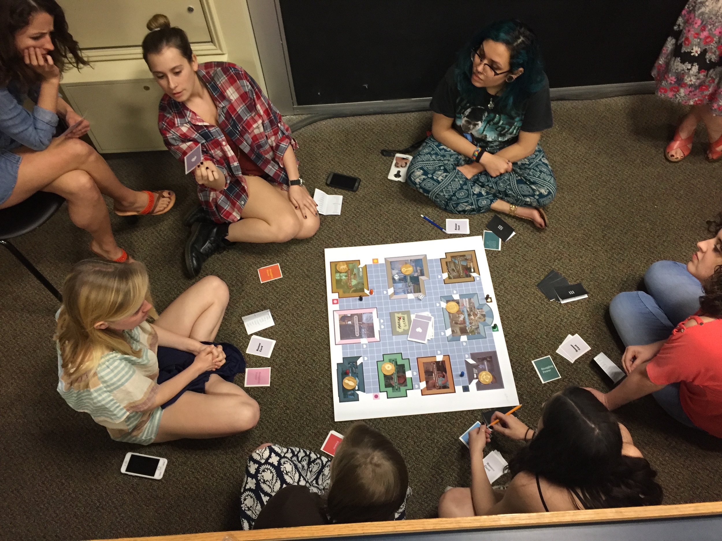
SNAG will be familiar to anyone who has played the game CLUE. However, instead of solving a murder, in SNAG players are tasked with figuring out how eligible bachelor, Mr. Write, was snagged—which single lady, in which apartment, used which prop to snag him? The game is designed to be amusing and fun however, it also comments on common tropes found in 20th century film and text that fit into a genre of single lady apartment plots. The purpose in designing the game SNAG is to present a way of understanding the cross section of concepts that 20th century single lady apartment plots present, such as the dispositif, the female flaneur, and the male gaze.
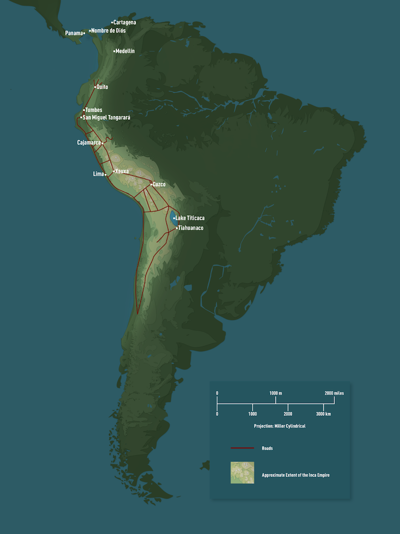
Following my interest in verbal and visual languages and their impact on culture and societies, I studied and worked in collaboration with Associate Professor Michael Schreffler to develop maps for his up-coming book on the Inca Empire. There is no know written language for the Inca Empire, however, through the development of complex visual patterns found in textile design, architecture, and metal works from the Inca scholars have found a highly developed visual language. Under Professor Schreffler’s guidance I was able to study this language and wrote a visual essay on the way that the Inca Empire “branded” itself. Download and read the essay.
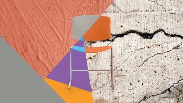
For Neocon in 2016, I concepted and worked with a team to create a video that celebrates the release of new colors ways for a classic Steelcase chair, Max Stacker. Perviously seen as a hardworking utility chair, this video repositions the chair to be more expressive, flexible, and appealing to consumers.
Concept: Heather Tucker
Animation by Eskimo
Created while at Auxiliary, Inc.
STEELCASE THREAD PRODUCT LAUNCH
I was involved in the launch of a new Steelcase product, Thread—a power distribution system. I art directed several communication deliverables including: product and lifestyle photography, technical illustrations, positioning copy, sales brochures, and an animation to visually explain how the product works.
Art Director & Designer: Heather Tucker
Photographer: Jeremy Frechette
Stylist: Katie Huber
Animators: DartFrog Creative
July 2014–October 2015
Active Learning Kit
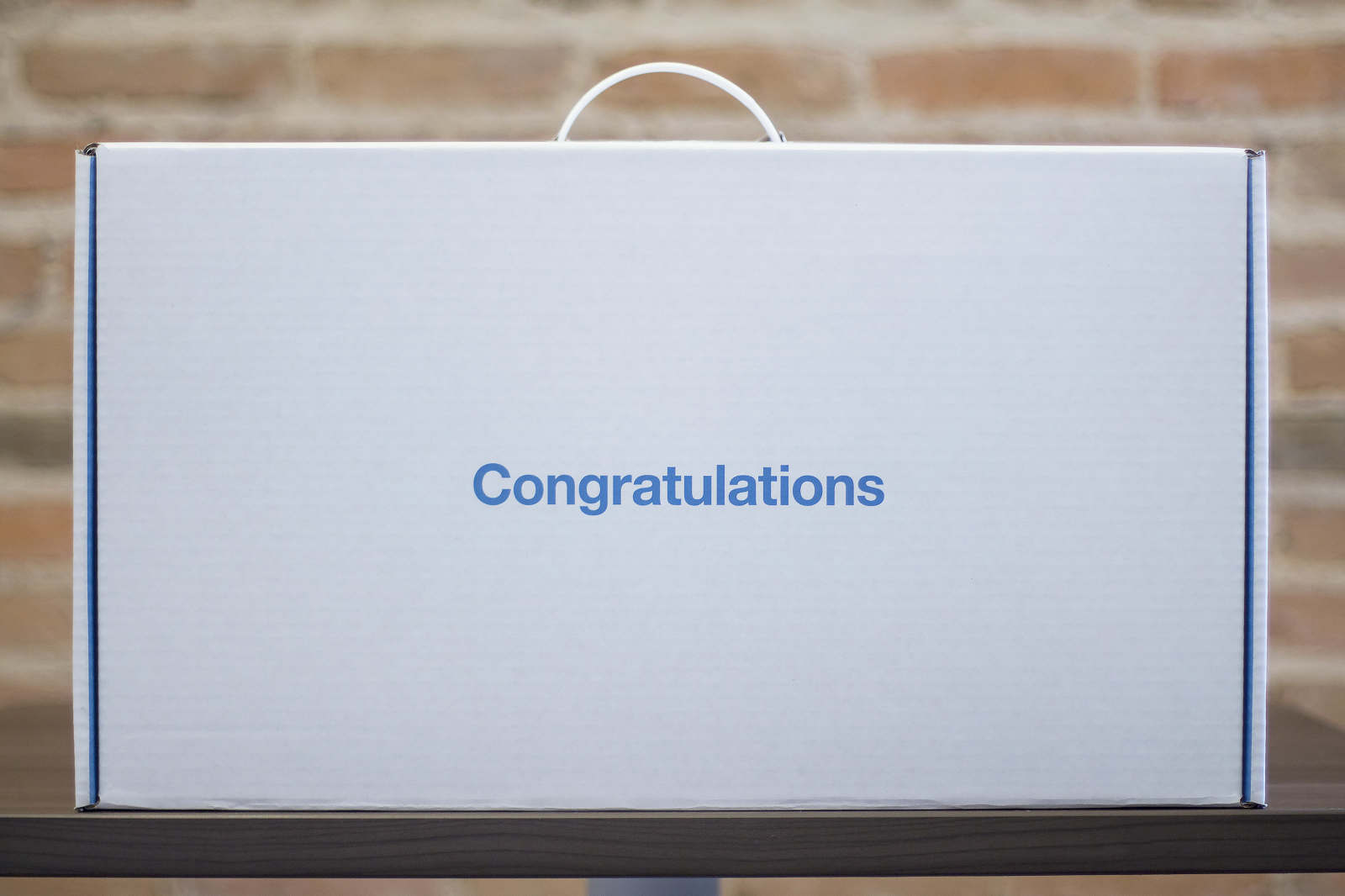
The Active Learning Classroom Grant was offered by Steelcase Education to nationwide educators. Applicants could win a new fully stocked Steelcase Education Active Learning Classrooms. The winner received this beautiful Active Learning Kit to communicate how to use the products. To honor the recipients of the grant, Steelcase wanted to provide a considered experience with custom packaging and messaging that excited and showed value.
Creative Lead: Heather Tucker
Designer: Jon Carbonall-Fergeson
April 2015
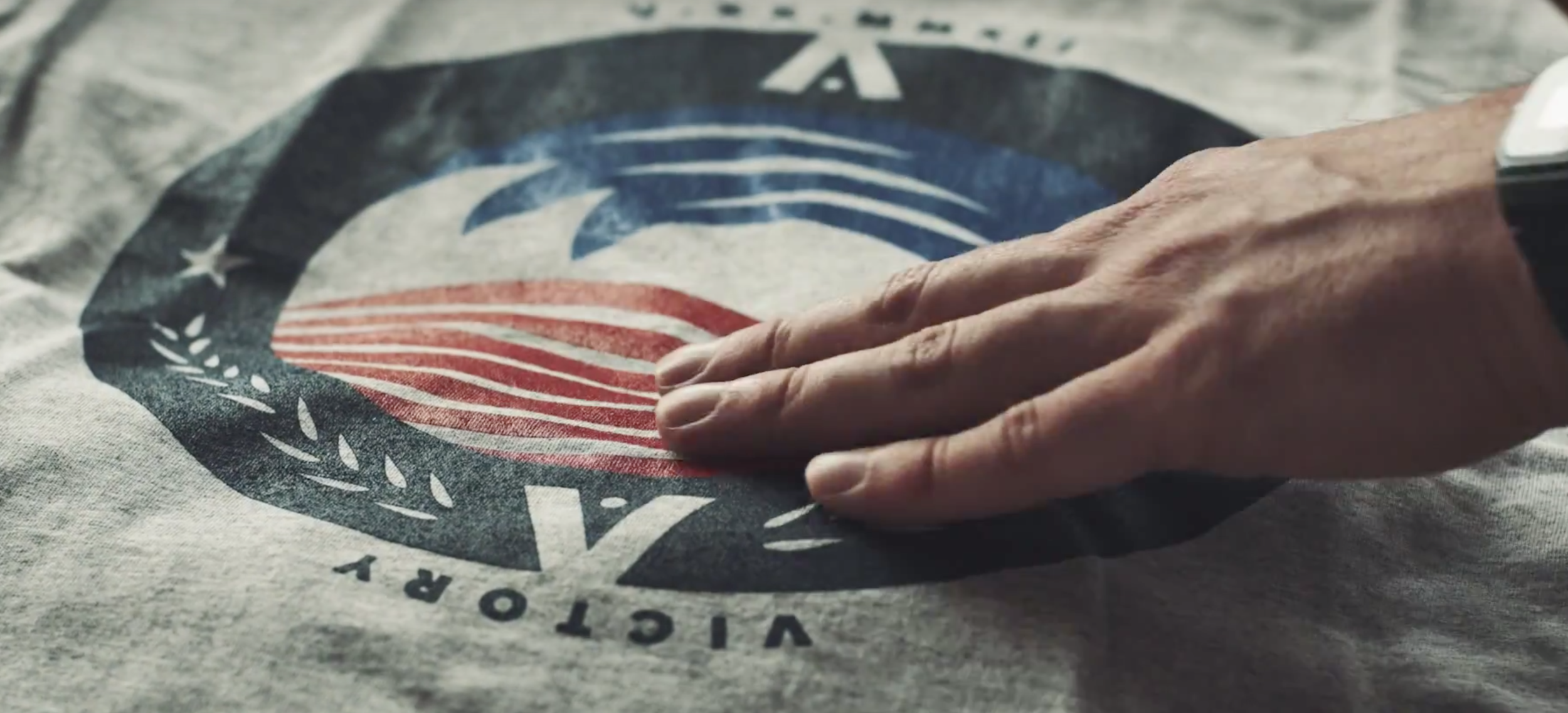
Together with a team, I helped concept and create a 2015 Memorial Day campaign for Chaco. The campaign #CamoCause celebrated Fashion Has Heart (FHH) a non-profit that benefits, inspires, and enriches the lives of veterans with art, design, and fashion. The campaign celebrated the release of a limited edition camo themed Z/Sandal wedding and a portion of the profits were given to FHH.
Creative Lead: Heather Tucker
Videographer: Sawyer Thurston
Writer: Emily Carbonell-Ferguson
May of 2015
CHACO FOOTWEAR
Holiday Campaign & Promotion
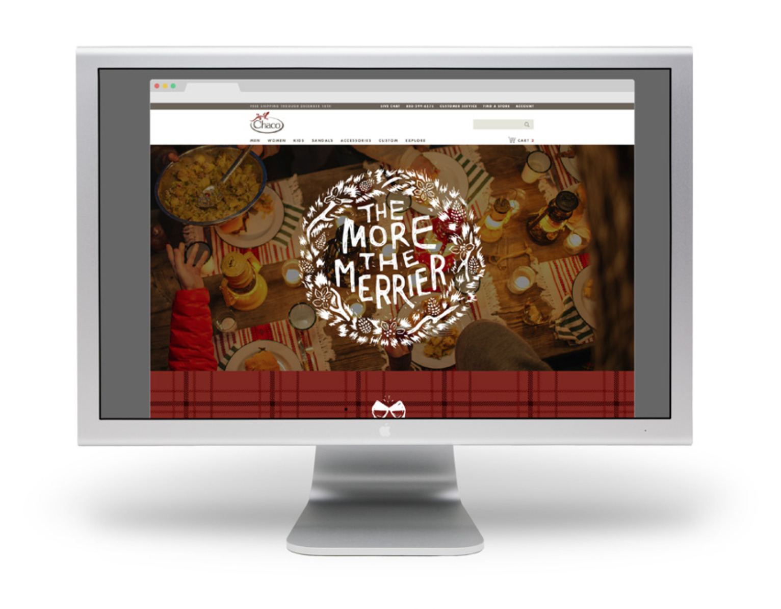
In 2015, I led a team in concepting and creating a Chaco holiday theme and promotion to drive traffic from social media channels to Chacos.com throughout the holiday season.
The theme "The More the Merrier" focused on friends & family gathering for the holidays. The promotion incorporated a chance to win four gift packs; one for the winner, and three to share.
For this project, we created promotional copy, illustrated lock-ups, icons, patterns, and social media assets. I also art directed a photoshoot of the prize items to use for promotion. To ensure visual and verbal consistency we created a style guide for the campaign.
Creative Lead: Heather Tucker
Illustrator: Laura Wiluz
Designer: Ben Petersen and Briana Garza
December 2015
Every year Thesis, Inc. gives away grants for graphic design students working on a thesis project. I worked on an awareness campaign for the 2013 grant. Below is a video we created and a poster that was sent out.
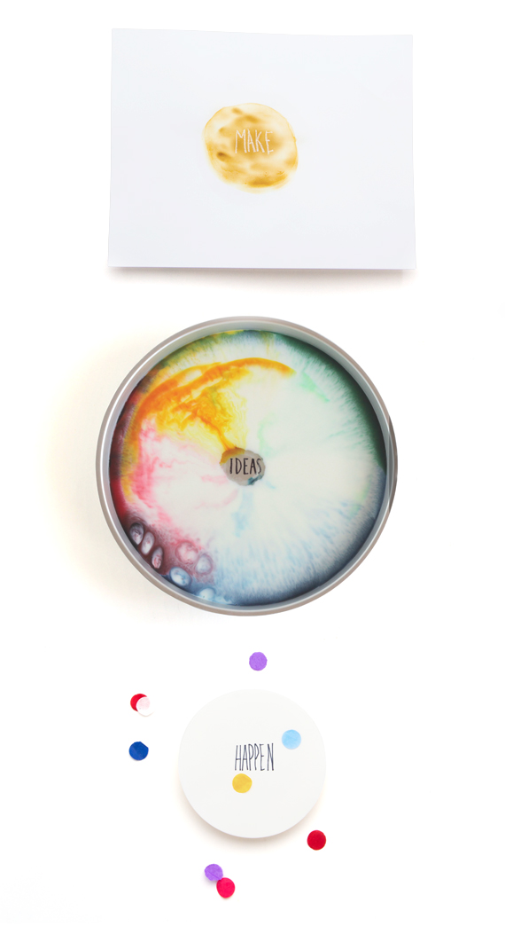
A great thesis project is the result of experimentation. My concept was to focus on experiments. An experiment being a scientific procedure undertaken to make a discovery, test a hypothesis, or demonstrate a known fact. My focus for the project was to make Ralph Waldo Emerson's quote come to life, "All life is an experiment. The more experiments you make the better."
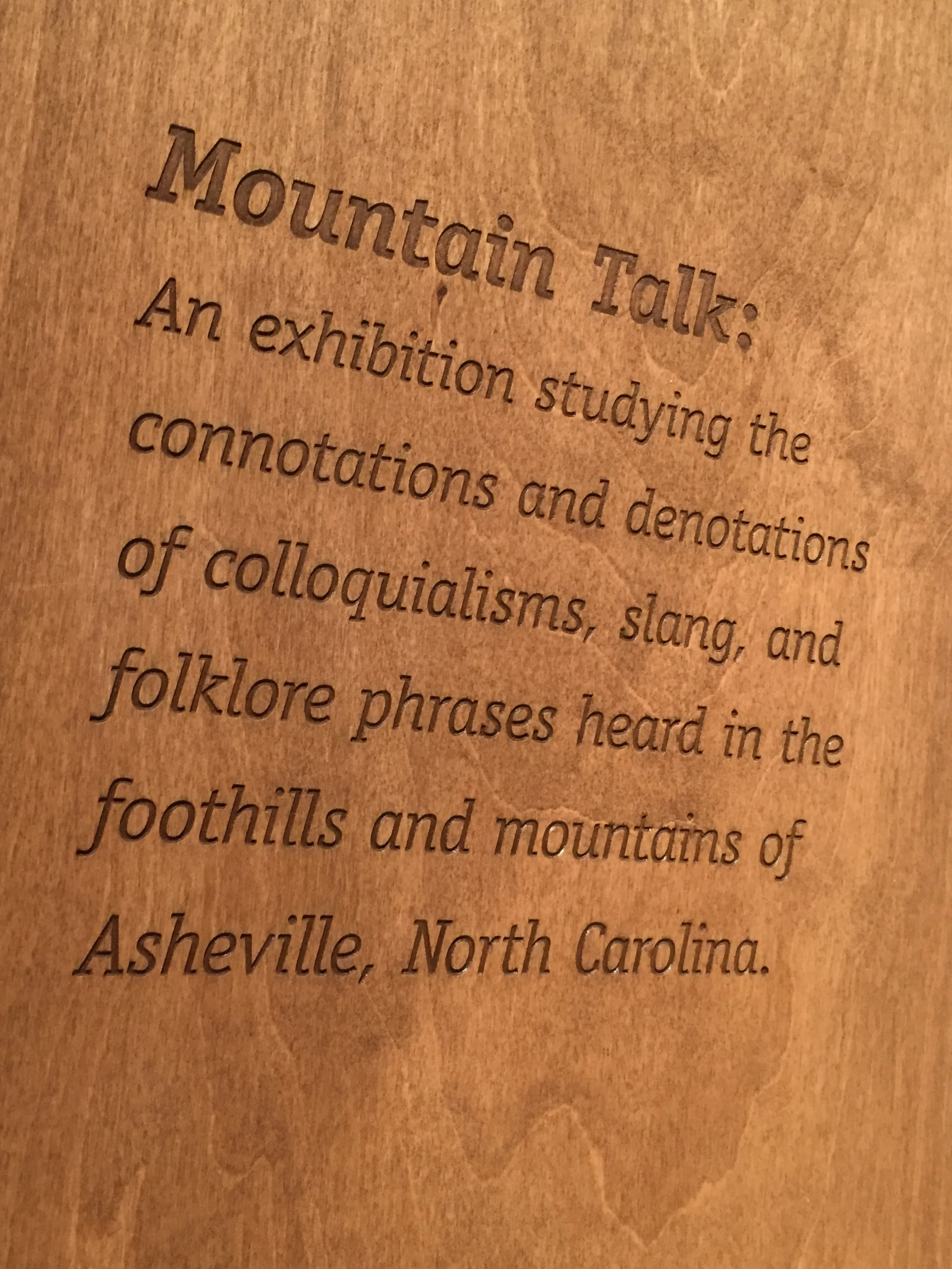
An exhibition of a posters series that studies the connotations and denotations of colloquialisms, slang, and folklore phrases heard in the foothills and mountains of Asheville, North Carolina.
The Project of Valor was a collaborative project with the University of Notre Dame, Segura Arts Studio, and South Bend Vet Center. It paired veterans and artist to create and exhibit projects that creatively reflected their military experience. I was paired with Jon Boller and Vietnam veteran that had collected and created scrapbooks full of memorabilia and sketches. One of the items was a small pocket size booklet outlined the code of conduct for all military men. When I met Jon I was struck by how he embodied this code of unity, loyalty, and fierce bravery in his everyday life. I worked closely with Jon to create a mono print that told his story through the artifacts he collected and sketches he made.
The final prints were exhibited in the South Bend Museum of Art.
As part of my graduate research, I concepted and designed the UX design for an application that collects and preserves unique and unusual aspects of regional American English speech patterns. Currently, the project headed towards the development phase in the design process.
Date: 2017
Concept & UX Design: Heather Tucker
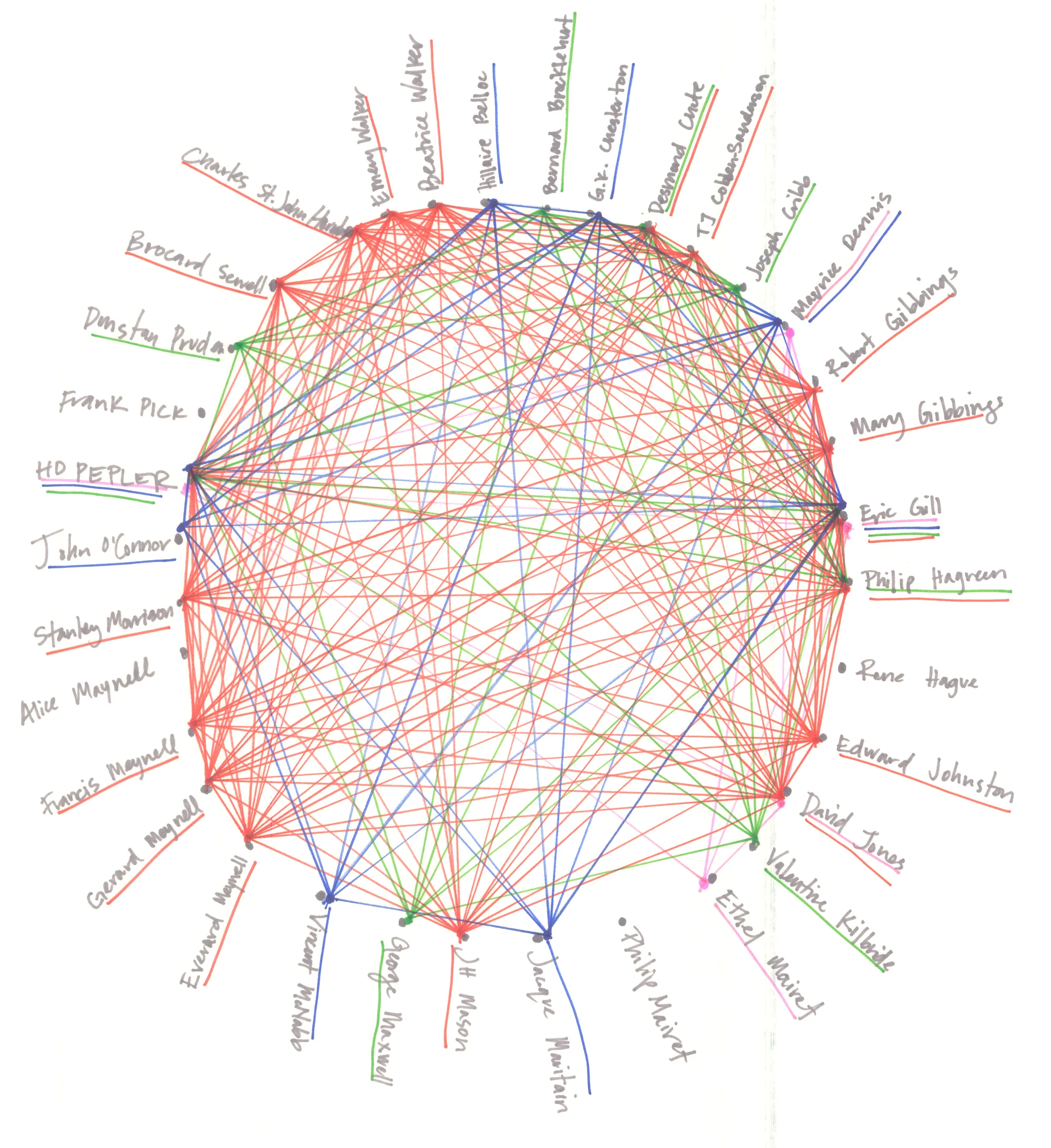
Visualizing the World of the Saint Dominic Press is an on-going, collaborative project that began in Fall 2017 between University of Notre Dame’s Art History & Architecture Professor, Dennis Doordan and myself.
The objective for this research project is to visualize the web of personal connections and intellectual influences that shaped the Saint Dominic’s Press—a significant chapter in the story of the English Private Press Movement. Interested in learning more, read the essay >
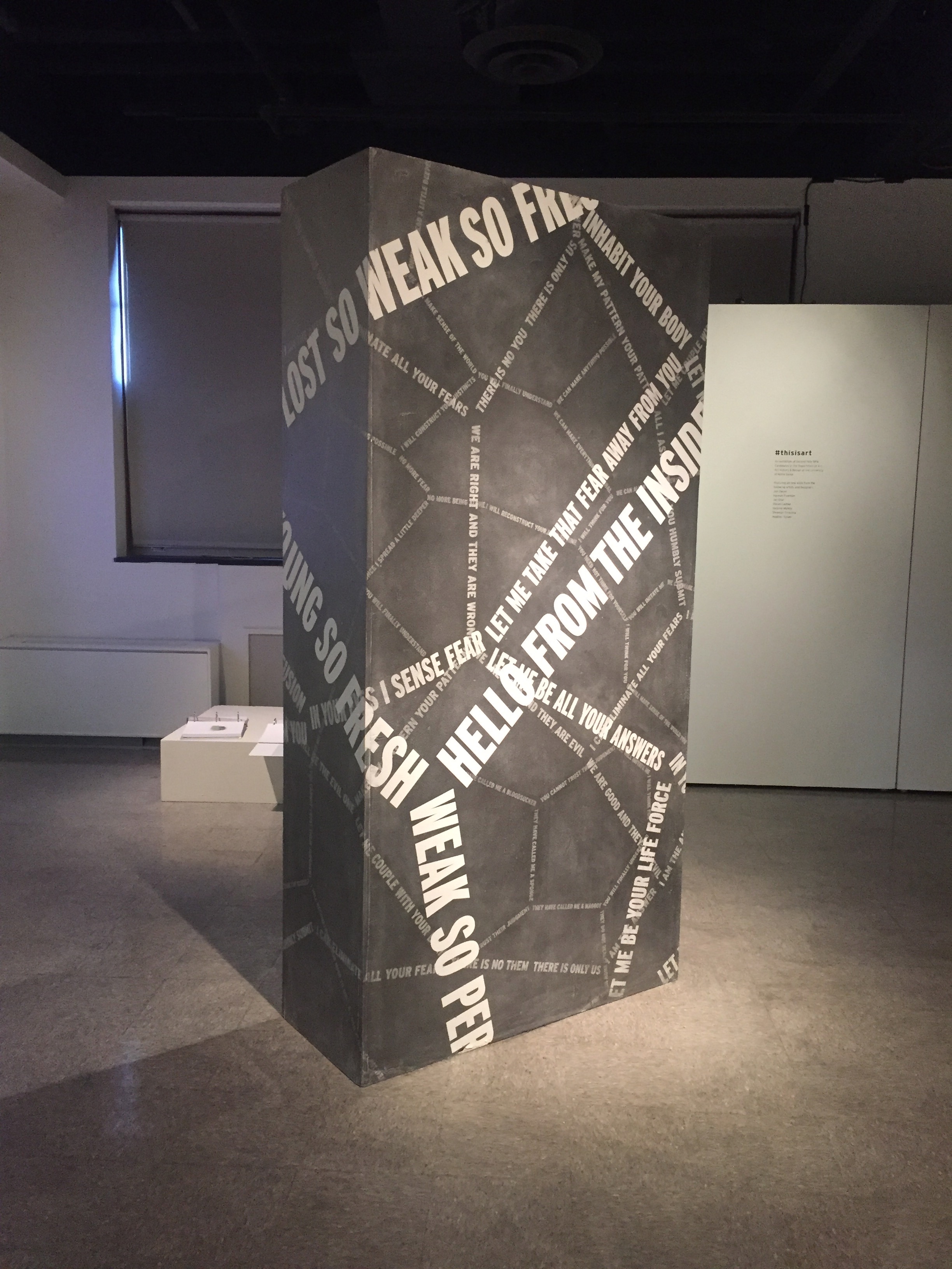
Conversing with Parasites is a series of text-based installations that investigates the behaviors of dominant languages habits. Inspired by William S. Burroughs who claimed that, “language is a virus from outer space,” this work verbalizes and visualizes dominant language habits in order to reveal the parasitic nature that language has on social systems. Like a parasite, language infects, adapts, reflects and manipulates perceptions. Both are contagious mechanisms that govern the way we exist, move, influence, and decipher the world.
Conversing with Acanthamoeba is made by scaling and layering verbal fragments to form a dimensional visual pattern that is reminiscent of a microscopic view of the brain-eating parasite, Acanthamoeba. The material used is graphite, which like language is transferable. When touched it will rub off on anyone that interacts with it.
Conversing with Toxoplasma Gondii seeks to communicate the gripping nature that language has on our minds. In this piece the words grow in size and intertwine with each it verbalizes and visualizes the behaviors of language and the parasite Toxoplasma Gondii. From a natural seam in the wall words emerge with a greeting, “Hello, from the inside…” The words continue in a growing pattern across the wall, “When we met, all I wanted was your body. I started with your muscles, that layer of thickness that lives just under your skin. But it wasn’t enough. I needed more.” Using white vinyl on a white wall the viewer is drawn in as the text creeps along, “I wanted to see what you saw so I had to inhabit your eyes. But it still wasn’t enough. I needed more.”
Conversing with Acanthamoeba
Location: University of Notre, AAHD Gallery
Materials: Charcoal
Approx. Size: 20’11” x 10’9”
Date: 2018
Conversing with Toxoplasma Gondii
Location: University of Notre Dame, Riley Hall, Basement Foyer
Materials: Vinyl
Approx. Size: 20’11” x 10’9”
Date: 2017
Conversing with Toxoplasma Gondii Prints
Materials: French Paper, Screen Prints
Approx. Size: 8.5” x 11”
Date: 2017
Website and identity development for freelance writer and food enthusiast, Marcia Davis. The identity, like Marcia, needed to be flexible and multifaceted. Using a dimensional typeface, a warm color scheme, and patterned elements; the visuals create a sense of place for Marcia brand called ‘Chez Marcita’. In addition to a portfolio website, Marcia needed blog dedicated specifically to her writings about food.
Designer: Heather Tucker
November 2012
Designed While at Thesis, Inc.
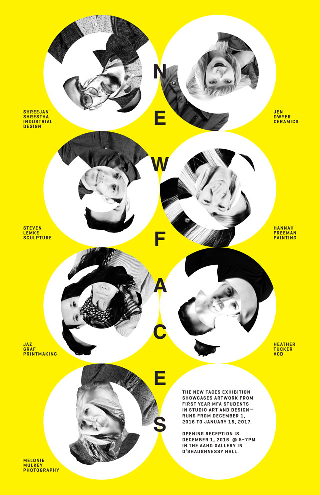
Promotional materials for the first-year MFA exhibition with the annual title of “New Faces.” Printed and motion posters where used to brand and promote the show.
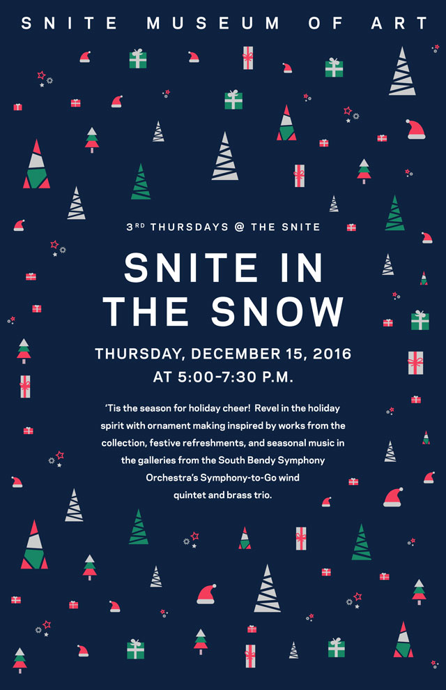
Promotional posters for University of Notre Dame’s Snite Museum of Art.
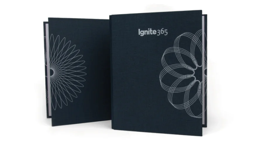
Ignite360 event branding for Wellness & Prevention, a Johnson & Johnson brand. Designed key graphic theme and all event branded material.
Designer: Heather Tucker
Created while at Thesis
2016
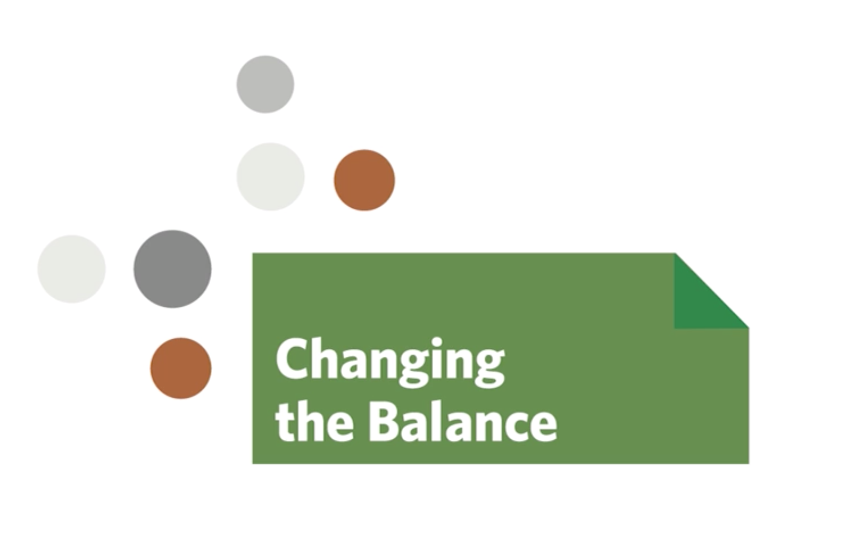
Changing the Balance
Changing the Balance is an program supported by the Niles Public Library, aimed at encouraging financial literacy to the community through a series of classes, self-directed studies, and workshops. I work on the identity development and several PSAs in collaboration with the library to bring awareness to the cause.
Designer: Heather Tucker
Writer: Maria Davis
Created while at Thesis, Inc.
2016